David Rivers Product Photography Website Design

Background & Problem Statement
Product photography websites have an identity crisis. No positioning, no personality, no strategic thinking – just work, a contact form, and hope that leads will decide based on portfolio and price.
This was the challenge I set myself with the David Rivers project – to create a website that positions him as a strategic creative partner operating at the level of the high-end brands he shoots for.
David specialises in three categories: beauty, health, and fashion. His clients include high-end fashion brands seeking creative product shots, e-commerce players in beauty and health, and established brands where skill and expertise matter more than competitive pricing.
The problem wasn't the quality of work. It was the absence of positioning. When photographers present generic template sites, they force clients to evaluate on three factors: who they know, the work itself, and price. That's commoditised, not strategic.
What's at stake? Premium brand clients. When you're shooting for companies where brand identity extends through every touchpoint, your website needs to reflect that same strategic thinking.
This project became about proving that product photographers can command premium rates by positioning themselves at the same visual and strategic level as the companies they work for.
Brand Research & Strategy
In product photography, everyone's portfolio looks professional. So how do brand marketing teams actually choose? In the absence of strong positioning, they default to who they know, recommendations, and price.
The strategic insight was simple: if photographers position themselves as high-end through design, they can raise their rates through perceived value. In a visual industry, your website is proof of your creative and strategic capabilities.
The brand values I established for David were: bold, contemporary, energetic, confident, and commercially sophisticated. This needed to feel like a high-end fashion brand's digital presence.
The strategic direction centred on creating a site that would be remembered. The electric green was a deliberate, aggressive choice – not for the faint-hearted. It's a colour that demands attention, which is exactly the point. David's ideal clients aren't looking for safe. They're looking for vision and confidence.
The goal was to make leads think: "This photographer understands brand positioning at our level."
Visual Identity & Website Redesign
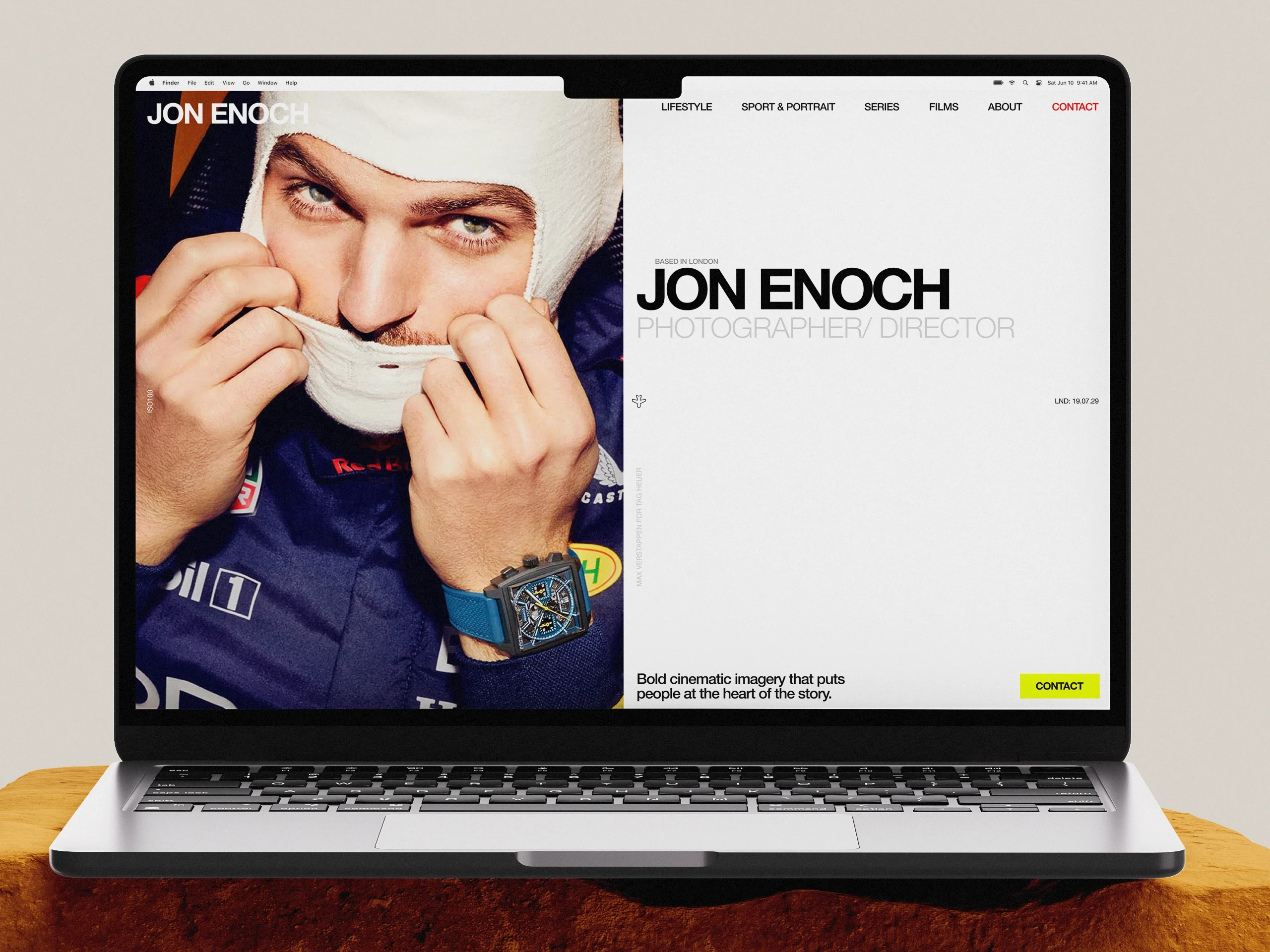
The visual identity needed to be a statement. I created a condensed, bold typographic logo for "DAVID RIVERS" – the kind of typography you'd see in high-end fashion editorials. Punchy, modern, impossible to ignore.
The colour palette is unapologetically bold. Electric green for calls-to-action and accent moments, deep charcoal for authority, off-white for breathing room. The green is the hero – vibrant, energetic, memorable.
The typography throughout maintains that punchy approach but plays with hierarchy. Large, condensed headlines dominate certain sections, whilst other areas use barely visible treatments – controlled chaos that feels right for creative product work.
The site opens with bold, fast-transitioning sections hinting at each category – images fade in and out quickly, forcing viewers to scroll. This isn't passive browsing; it's active engagement.
The "trusted by" section establishes credibility before diving into floating, large-scale imagery – beauty products, health supplements, fashion items – deliberately placed to make your eyes move left to right. It maintains attention and creates rhythm.
Testimonials use flip cards for interaction – social proof delivered with energy. Full-bleed imagery alternates with bold typographic moments and breathing room. The grid is present but broken – structured enough to feel professional, disruptive enough to feel contemporary.
The calls-to-action are direct. "LETS CREATE" positions the relationship as partnership, not service transaction. The electric green makes CTAs impossible to miss.
The result is a website that feels like a high-end brand's digital presence. David isn't positioning himself as a photographer for hire – he's a creative partner who operates at the same level as the brands he works with.
Final Thoughts
In a visual world, your positioning is your pricing power. For product photographers working with high-end brands, the website is proof that you understand brand identity at the level your clients operate.
Template sites commoditise creative work, forcing brands to evaluate on portfolio quality and price alone. When every photographer has professional work, positioning becomes the differentiator.
By using bold, memorable design to communicate confidence and commercial expertise, you position yourself as a strategic creative partner. The electric green, the punchy typography, the dynamic layout – these are positioning tools that tell premium brands: I understand visual identity at your level.
For David Rivers, this approach transformed the website from a passive portfolio into an active positioning statement. The brands who resonate with this design are exactly the brands David wants to work with. The site pre-qualifies leads and justifies premium pricing because it demonstrates strategic thinking, not just technical skill.
If you're a product photographer thinking about your own site, ask yourself: does your website demonstrate that you operate at the same visual and strategic level as the brands you want to work with? Because in a commoditised market, positioning is what separates a £500 day rate from a £2,000 one.